From Sketch to Canvas: My First Gouache Painting Adventure
After my exploration with Winsor & Newton markers, I felt drawn to a new medium that promised more control and a different kind of expressive freedom. That’s how I stumbled upon gouache – an opaque watercolor that’s quickly captured my artistic imagination. This post chronicles my very first attempt at a full gouache painting, detailing every step from initial concept to the finished piece. It was a journey filled with experimentation, learning, and a bit of DIY ingenuity!
The Genesis of an Idea: From Doodle to Digital Concept
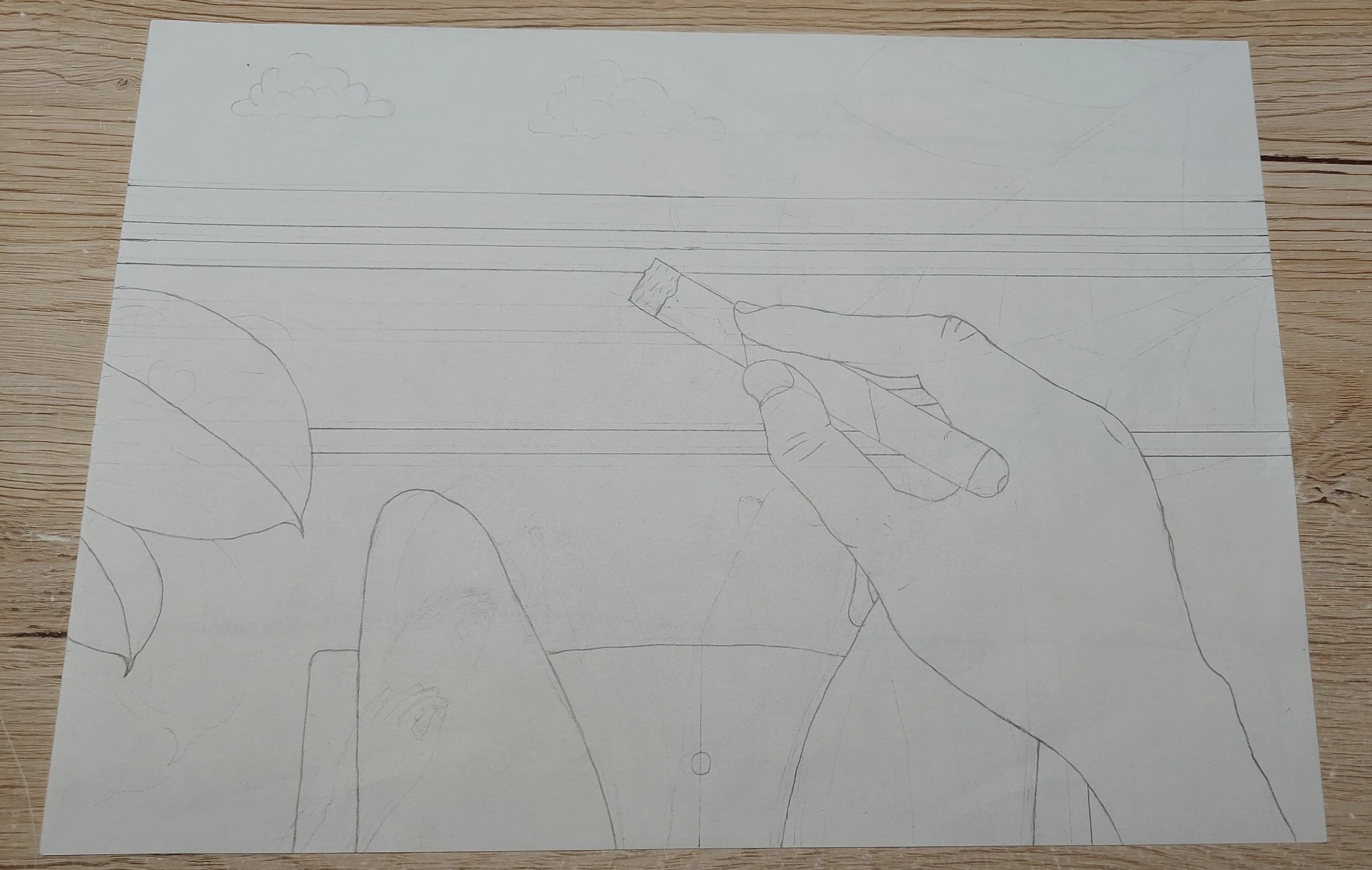
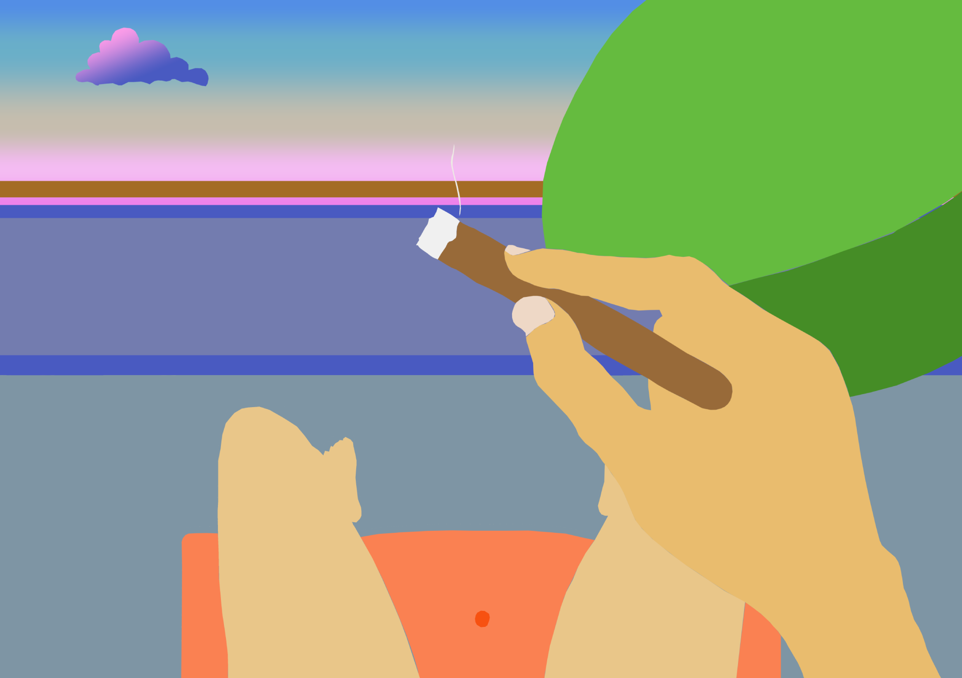
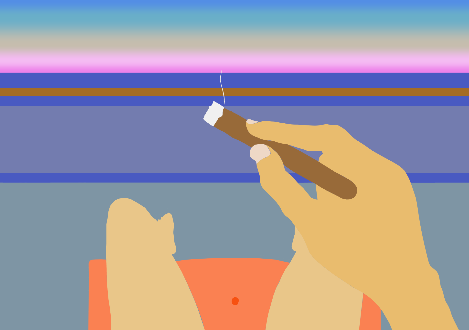
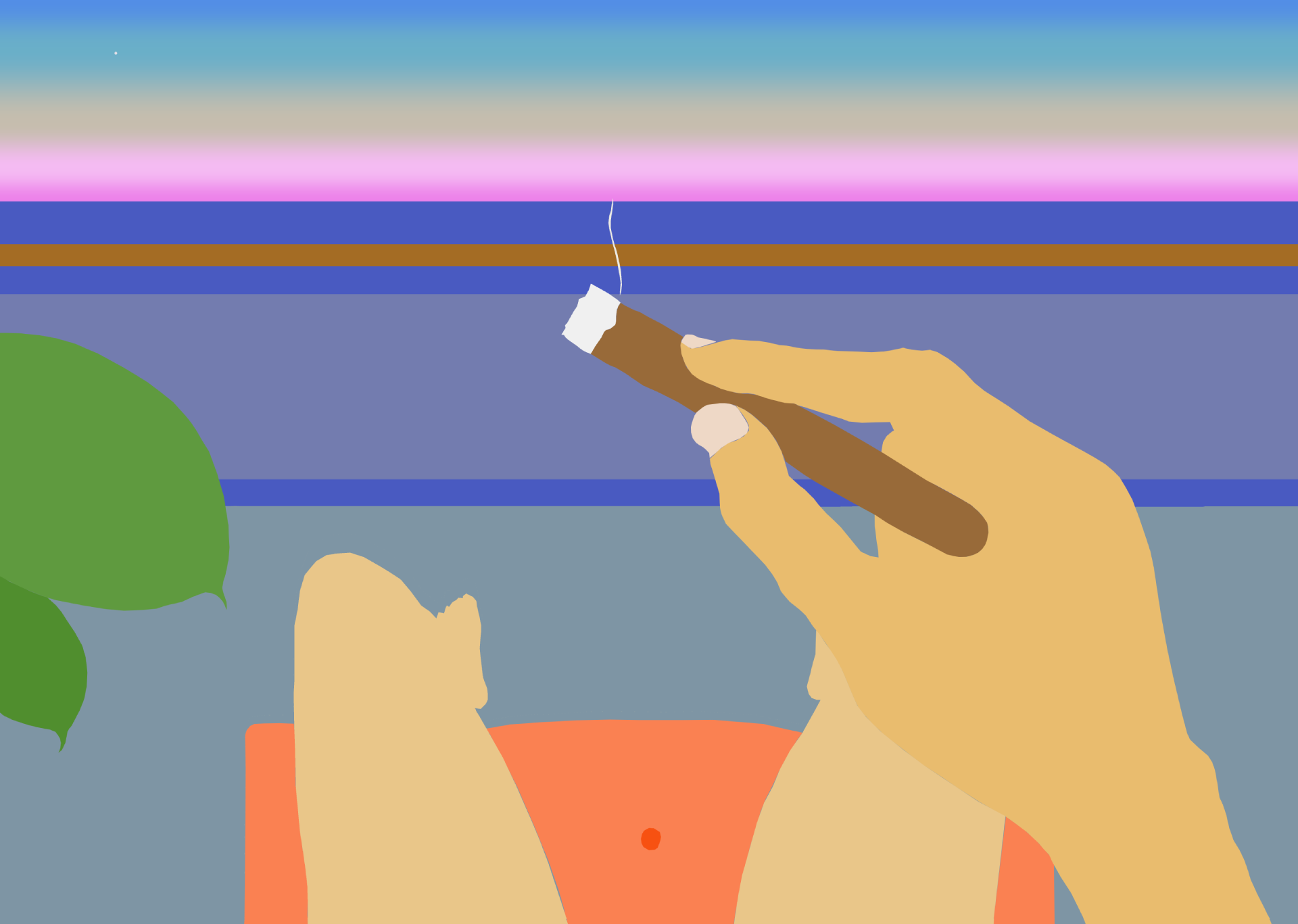
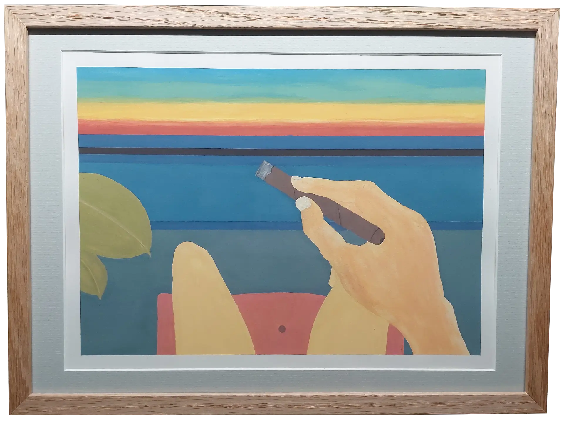
The concept for this piece didn't arrive as a grand vision, but rather unfolded from a simple, almost random, doodle. It started with a sketch of a matchbox. Then, a cigar appeared next to it. In that moment, a new idea sparked: what if the cigar was held in a hand? Just like that, the matchbox was erased, and the core of the composition was born. From that point on, the rest of the ideas seemed to emerge organically as the sketching continued.
Finalizing the composition was a meticulous process of trial and error. To give you an idea, I must have sketched a left foot over a dozen times on a single sheet of paper, only to ultimately decide against including it. It wasn't a matter of it looking wrong; rather, I felt a strong pull towards a more minimalist aesthetic, where fewer elements would carry more weight. This subtractive approach applied to other details as well, like the leaves and various background elements. I spent a significant amount of time refining not just their shape, but their precise placement within the frame.
At this stage, the digital world also proved to be very useful. After settling on a pencil-and-paper version I was happy with, I scanned the sketch and brought it into Photoshop. It served as a great environment to freely test the arrangement of each element and, most importantly, experiment with various color palettes to find the perfect mood before ever touching a brush.


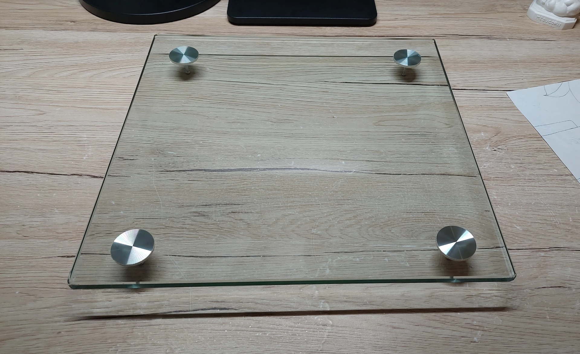
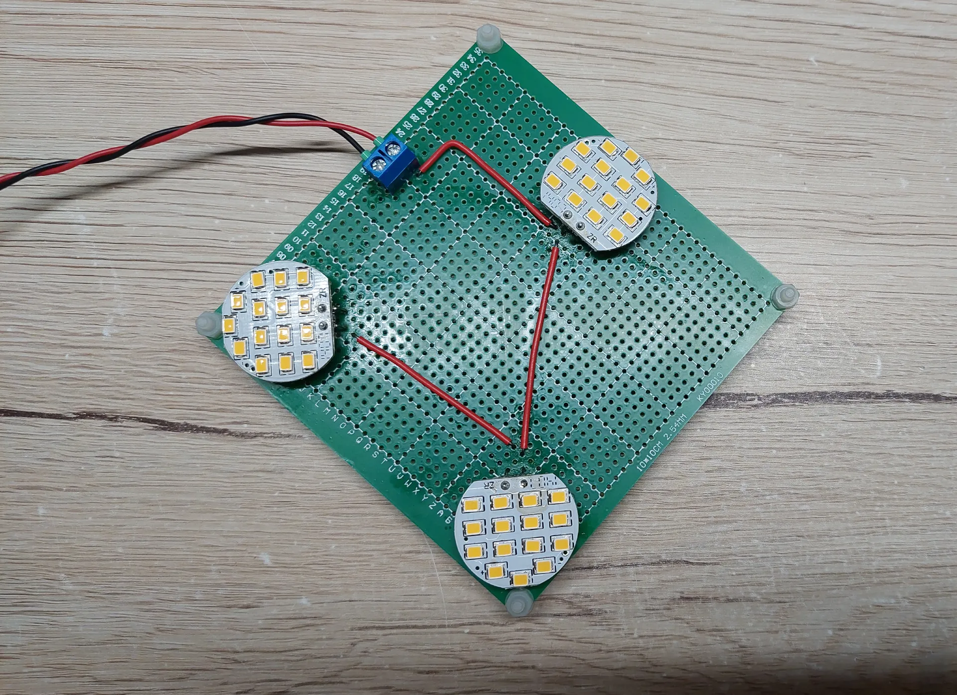
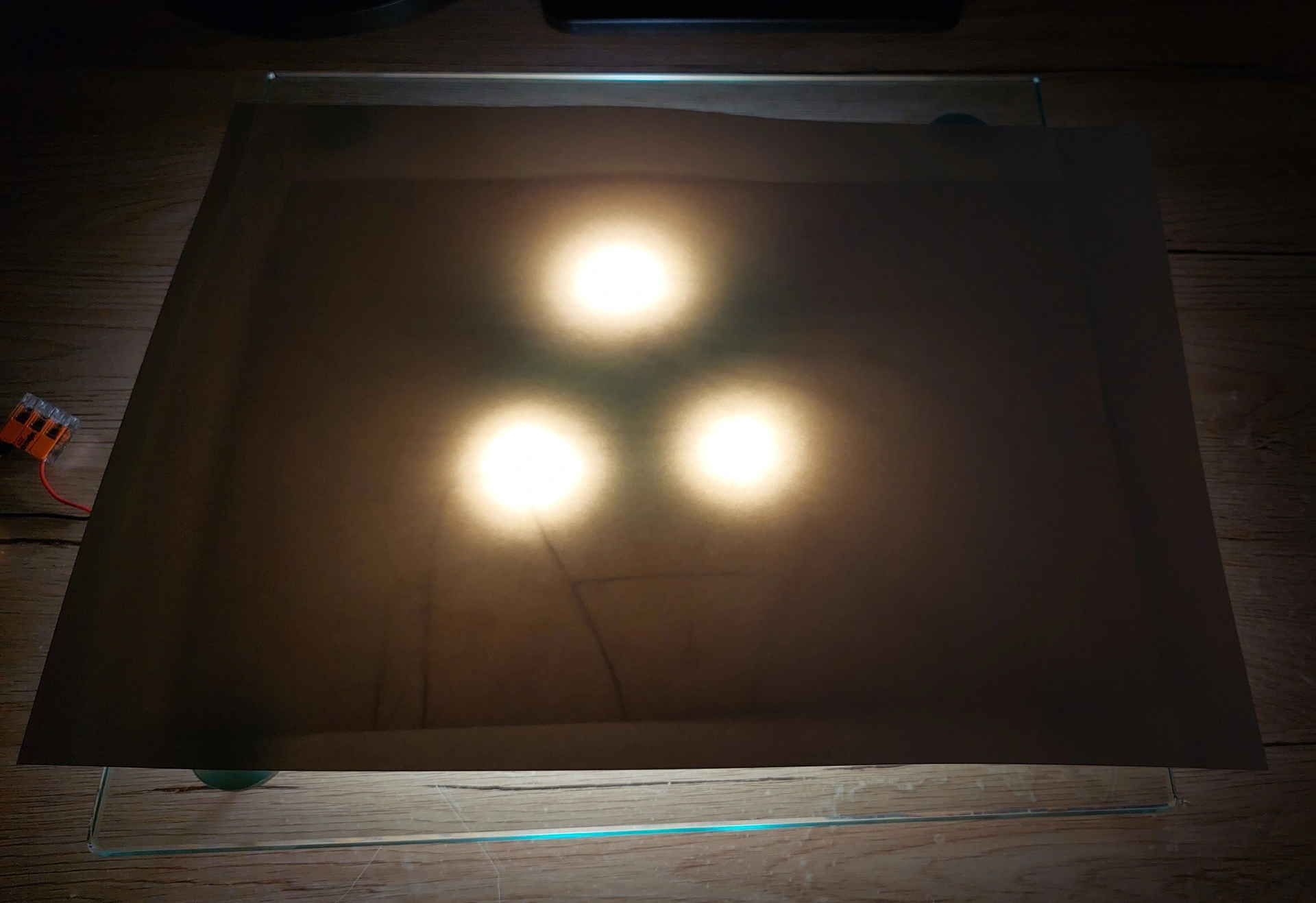
From Bathroom Scale to Light Box: A DIY Approach
One of the biggest challenges in traditional art is transferring a refined sketch onto the final paper without leaving smudges or damaging the surface with an eraser. Instead of using a traditional light table, I decided to build my own from some rather unconventional parts. The core of my device is the glass plate from an old bathroom scale, which I disassembled and fitted with four screws to act as stable feet.
Of course, a light box needs a light source. For this, I soldered three bright LED modules to a universal PCB, creating a slim, custom lamp. This unit slides perfectly underneath the glass platform, illuminating the entire surface evenly from below.
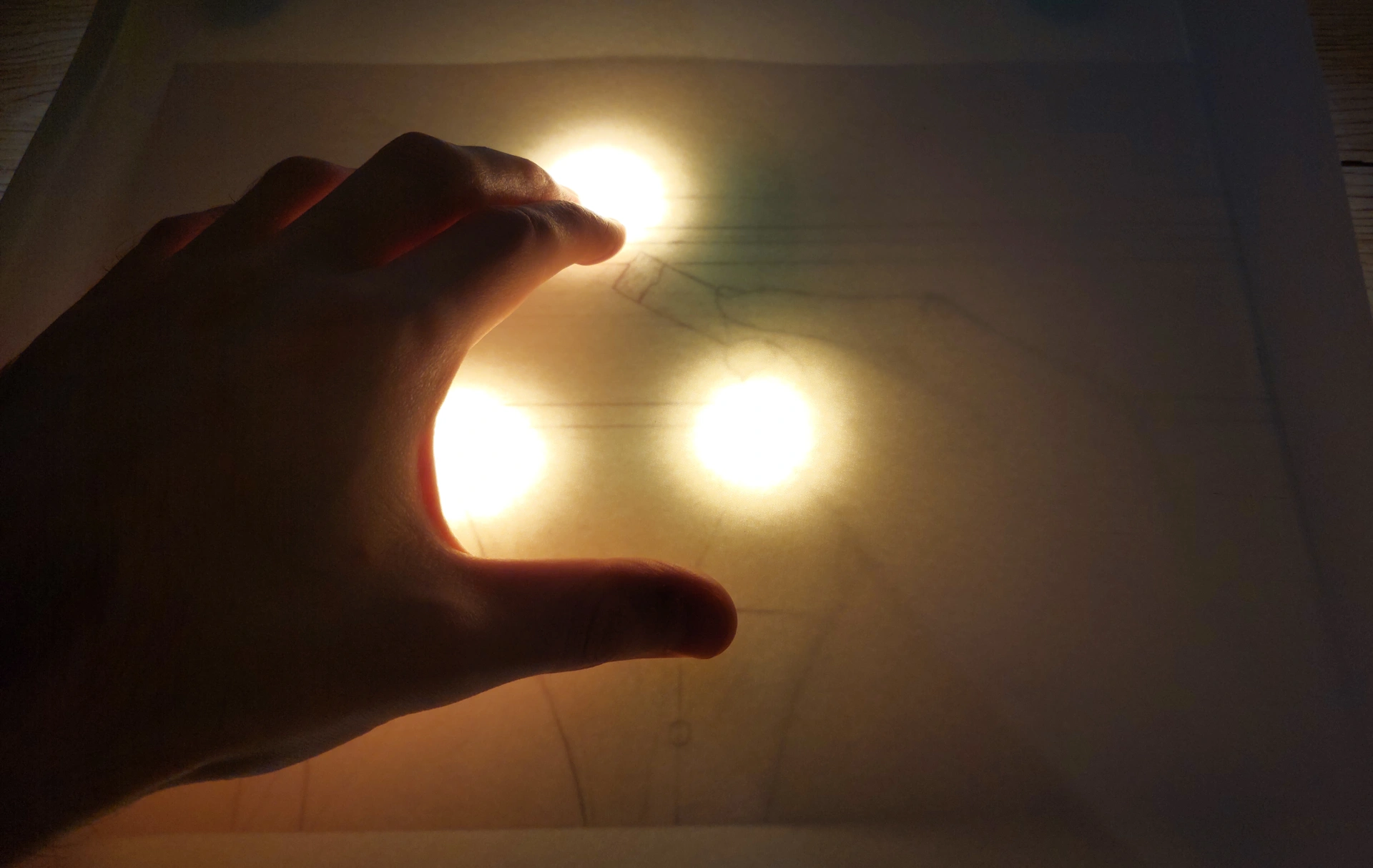
The process itself is simple but incredibly effective. I place my rough sketch directly onto the glass, then lay my final, clean sheet of paper on top. The powerful LEDs shine through both layers, making the original lines perfectly visible. All that's left is to carefully trace the design with a pencil, resulting in a clean and precise outline ready for painting.
Tools of the Trade: My Gouache Arsenal
After my adventures with markers, I knew that stepping into the world of gouache required a more thoughtful approach. Instead of buying a pre-made starter kit, I decided to meticulously build my own toolkit from the ground up. Each item was chosen for a specific purpose, creating a solid foundation for my first serious painting. Here’s a look at the core equipment I gathered:
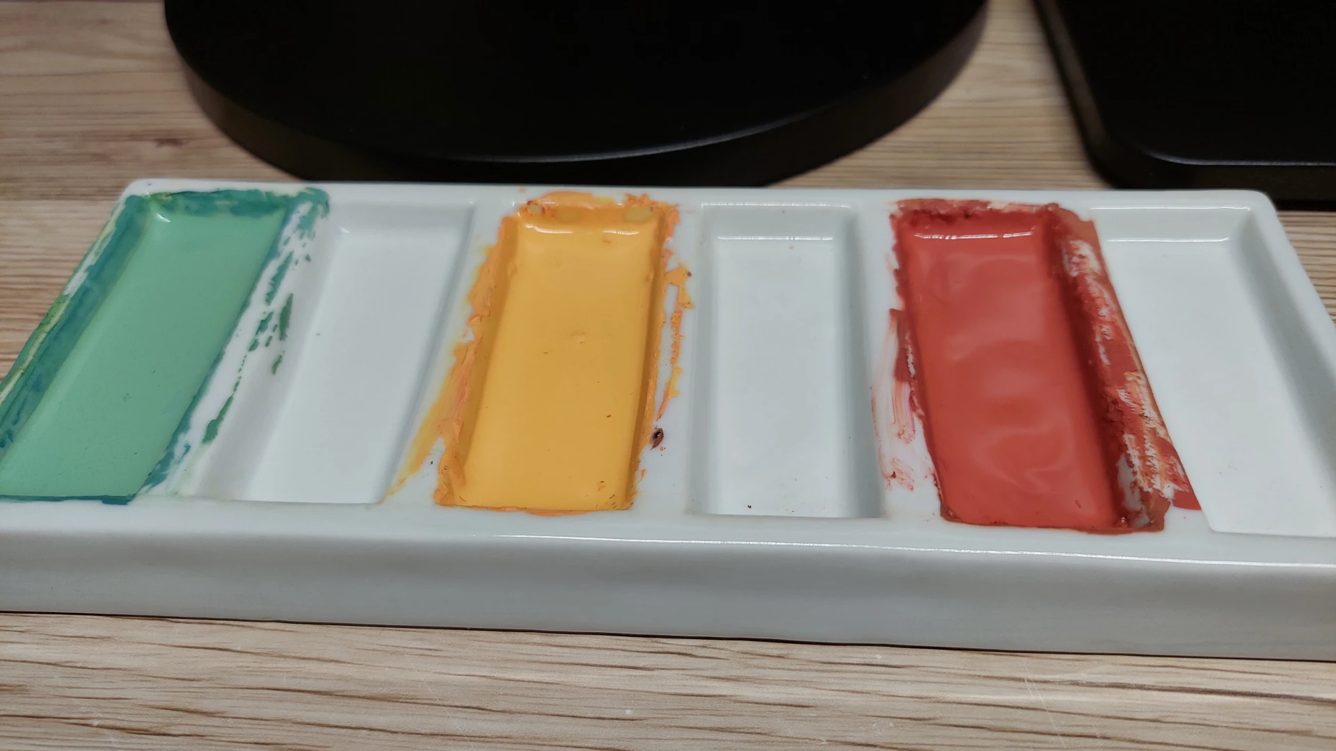
- 🎨 Winsor & Newton Designers Gouache: The heart of my new setup. I chose a specific palette of six colors to give me a full range of mixing possibilities: Ultramarine (Green Shade), Lamp Black, Permanent Rose, Zinc White, Permanent White, and Lemon Yellow.
- 🖌️ Brushes & Tools: For applying the paint, I invested in a versatile collection of Princeton brushes. I started with the Select Artiste Value Set 20 (6 pcs), and supplemented it with individual round brushes (sizes 1, 3/0, 5/0, 8, 12) and a 3/4" flat one for broader strokes. I also added a Phoenix painting knife for texture and mixing.
- 📜 Paper & Masking: My surface of choice is the Arches Hot-Pressed Watercolour Block (26 x 36 cm, 300g), which is a dream to work on. To keep my edges clean and preserve white areas, I use a combination of MT Washi Tapes and Winsor & Newton's Colourless Art Masking Fluid.
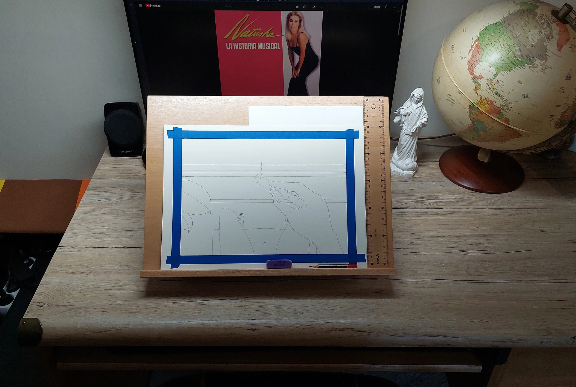
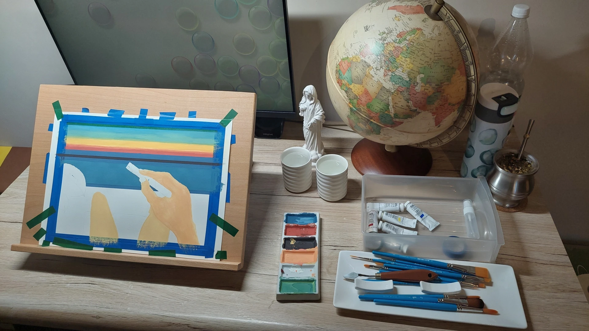
- ✏️ Drawing & Studio Essentials: For the initial sketch, I use Faber-Castell Goldfaber pencils (H and HB), kept sharp with a KUM Masterpiece sharpener, and a Lyra bread crumb eraser for gentle corrections. For mixing, I use two porcelain palettes, and my entire workspace is organized around a handy Ebro A3 table easel.
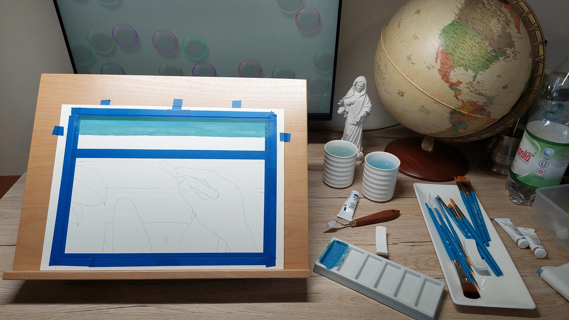
- 🥢 Porcelain Workspace Vessels: I dislike using plastic cups, so I searched for something more permanent and aesthetically pleasing. I found the British company Wilmax and bought two Japanese-style porcelain cups for my water and brushes, a sushi plate for storing and drying them, and even chopstick rests to hold my active brushes.
- 💡 Lighting: Good lighting is non-negotiable for detailed work. I use the Spacetronik GLOW D5, a shadowless LED drafting lamp that gives me consistent, neutral light at any time of day, which is crucial for accurate color mixing.
This carefully selected arsenal was my conscious investment in quality and creative freedom, allowing me to translate my digital vision into a tangible piece of art.
The Painting Process: Layers of Precision and Patience
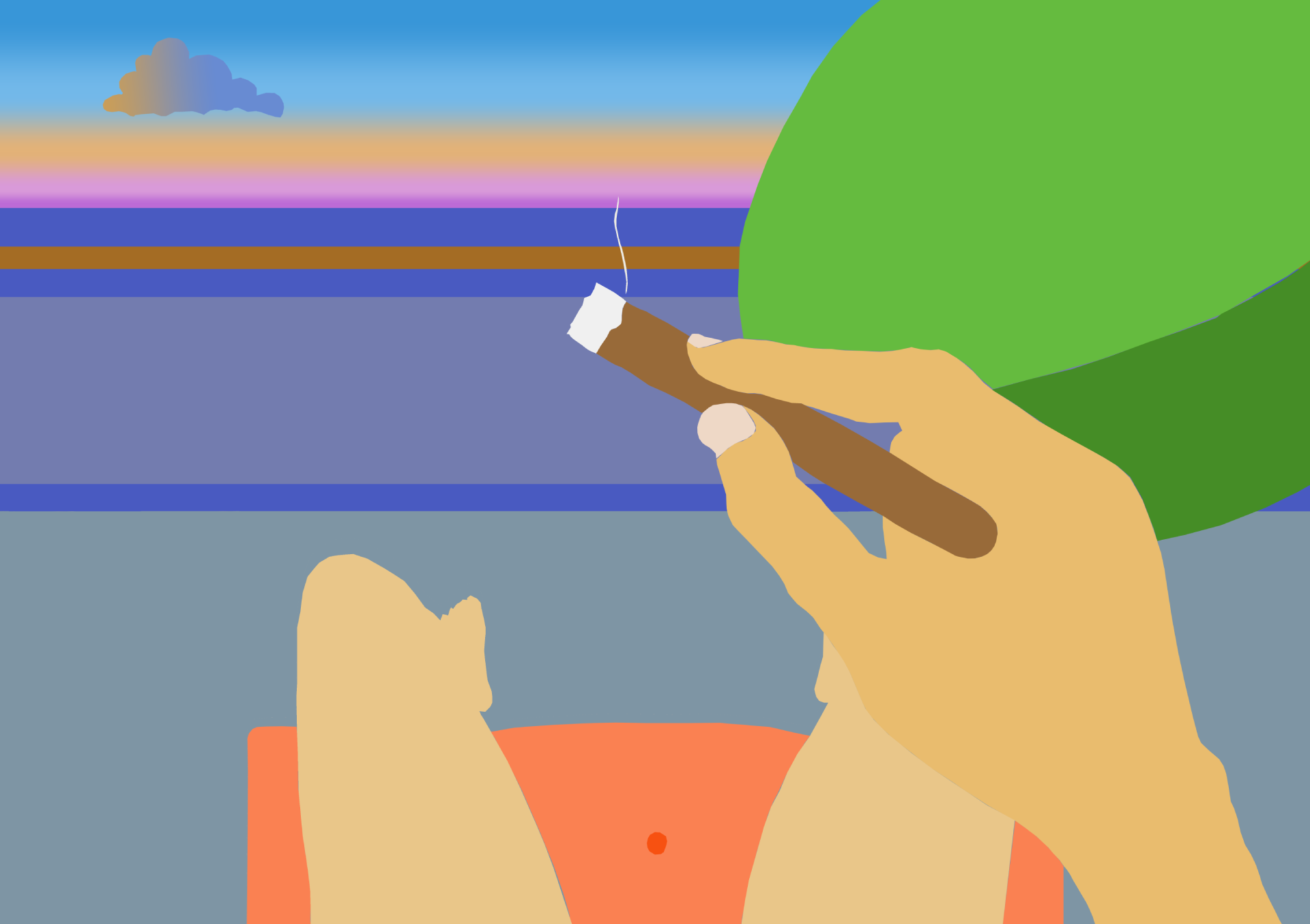
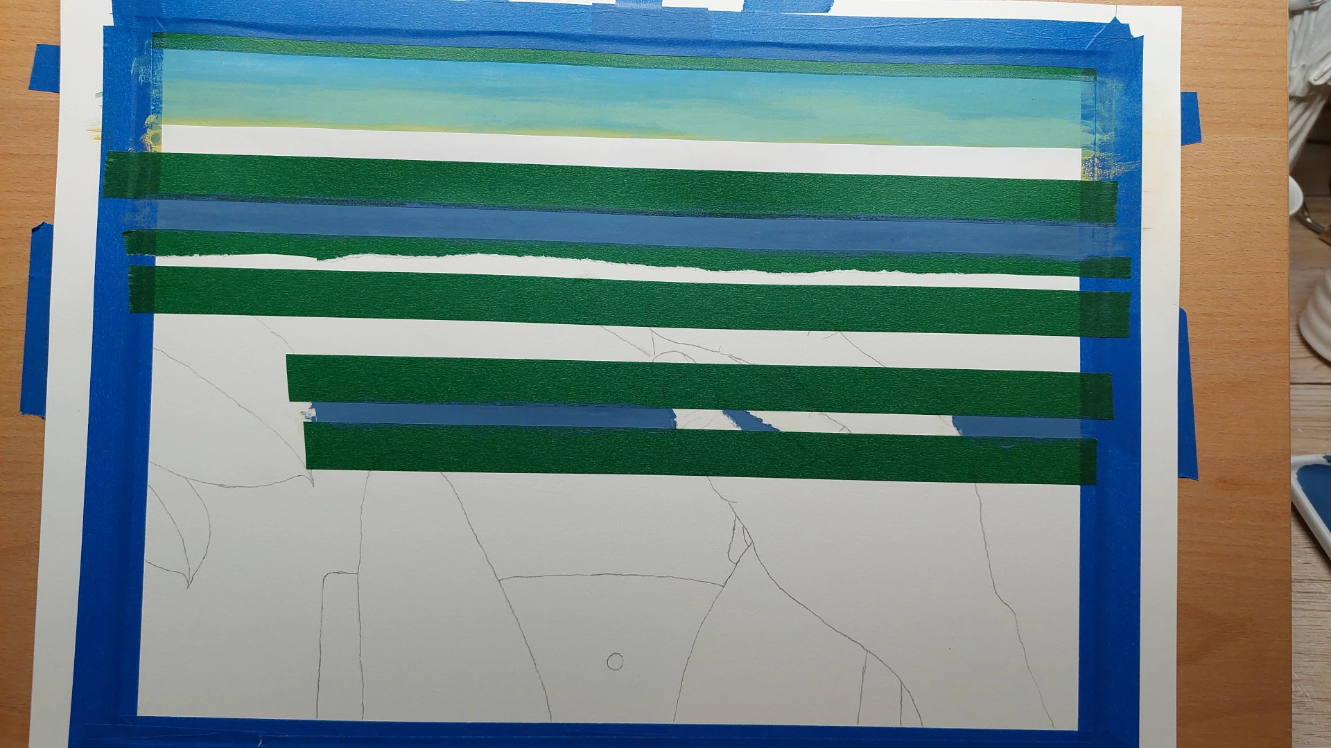
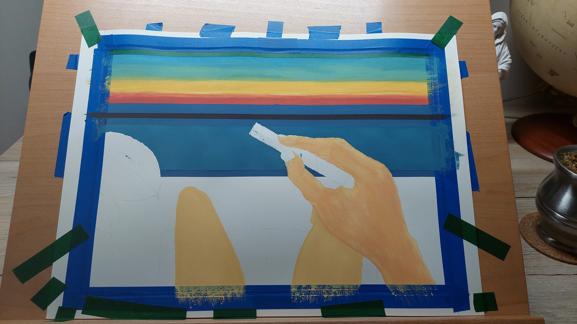
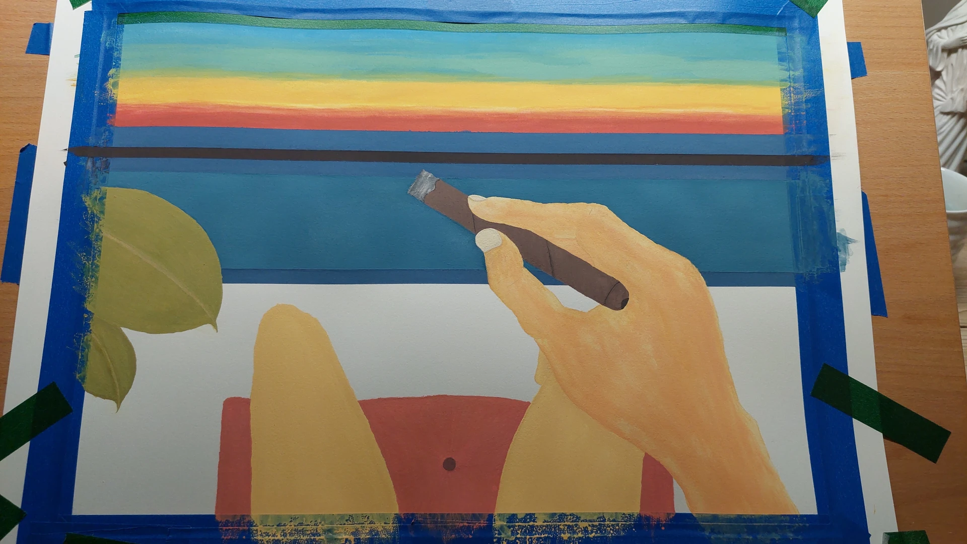
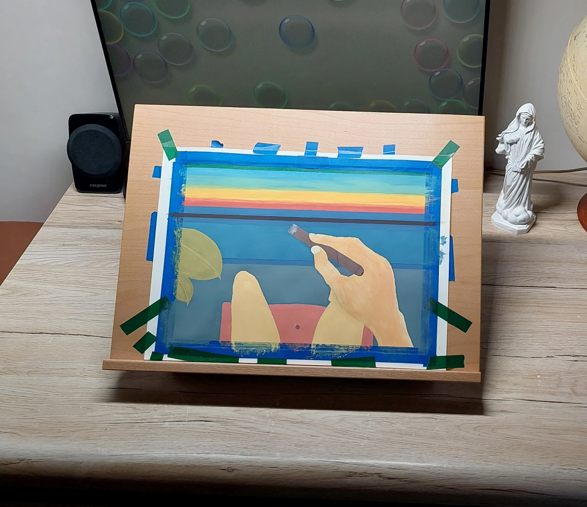
With the sketch transferred, the real challenge began. The first step was to meticulously mask the entire work area with washi tape—a task demanding precision down to half a millimeter. This accuracy was essential not just for achieving perfectly crisp edges, but to ensure the final artwork’s outer borders were straight and perpendicular. I decided to tackle the most difficult element first: the sky. While creating smooth color gradients in gouache is certainly possible, it’s not as intuitive as it is with other mediums like watercolors (using a wet-on-wet technique) or oils, where long drying times allow for extensive blending. It requires a specific, controlled technique, and I knew that if I could get the sky right, the rest of the painting would fall into place.
Throughout the entire process, my main focus was on maintaining a uniform, thin consistency of the gouache. This was actually my second attempt at this painting; on my first try, I applied the paint too thickly, which led to cracking as it dried. Trying to fix or remove the cracked layers without destroying the paper proved to be incredibly difficult. This time, I was determined to avoid that mistake. The goal was to achieve a finish so smooth and flat that it almost looks like a high-quality print, an effect that requires a great deal of sacrifice and concentration, as there is no room for error.
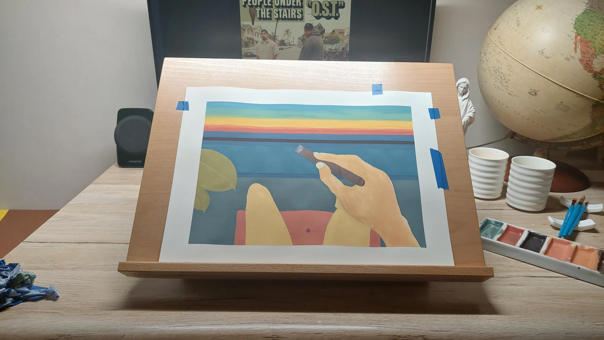
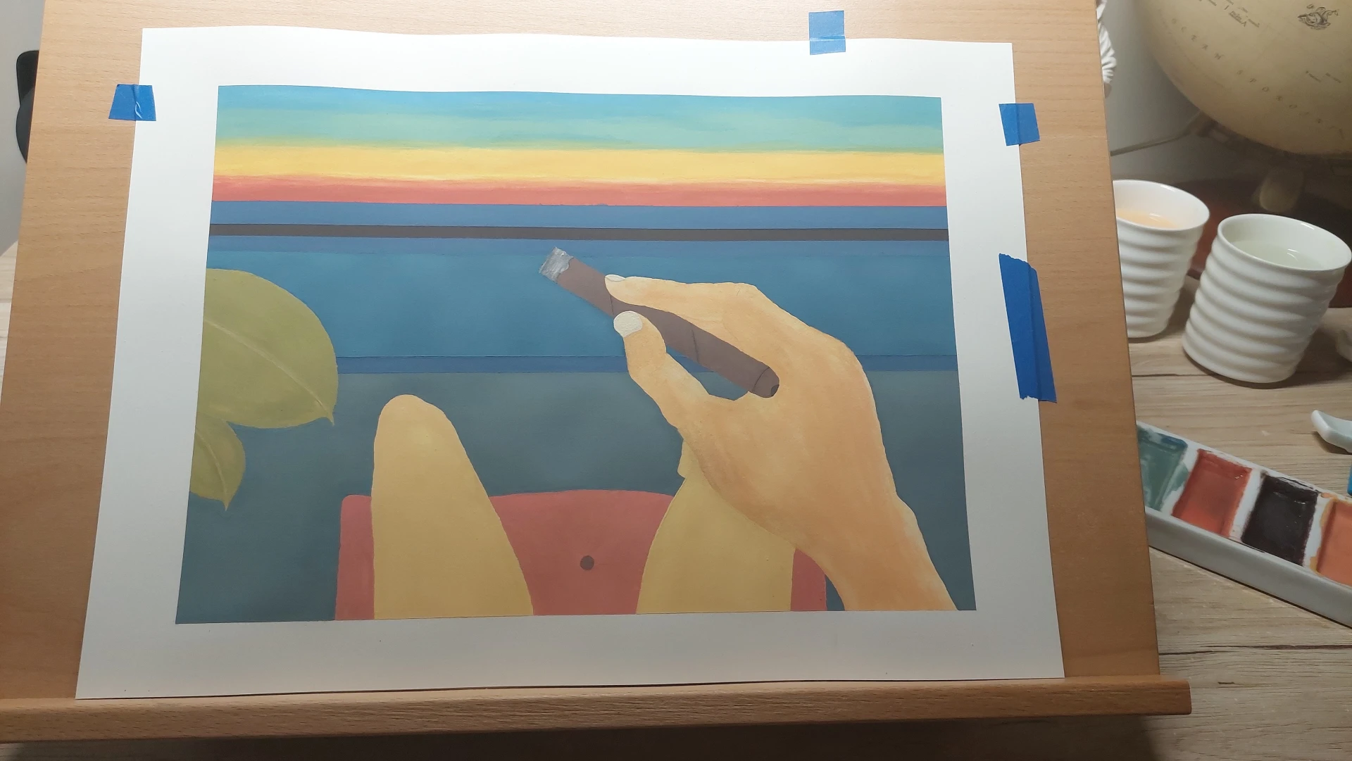
After the sky was complete, I moved on to the other elements. For large, flat-colored areas like the ocean, the barrier, its glass pane, and the floor, I continued to use washi tape to mask their borders, allowing me to paint carefully within the lines for a perfectly clean finish. For more intricate shapes where tape wouldn't work, I turned to the Winsor & Newton masking fluid to protect the paper.
One of the happiest accidents occurred while painting the hand. I had composed an interesting color mix that included Lemon Yellow, a color which, according to its specifications, is semi-opaque. This slight transparency turned out to be a blessing, allowing me to build up layers that created a natural, varied skin texture instead of a single, flat tone. Other areas, like the cigar ash, presented their own unique challenges, but in the end, I’m pleased with how they turned out.
The Finishing Touch: Framing the Artwork
A piece of art isn't truly finished until it's properly presented. For this painting, I wanted a frame that would complement the colors and composition without overpowering them. I ordered a custom-sized raw oak "Koudou" wooden frame and a grey passe-partout from Mende Frames.
To ensure the dimensions and color combinations were perfect before ordering, I used a special AI-powered visualizer tool. This simple webpage, coded for me by Gemini AI, allowed me to upload an image of my painting and test different frame and passe-partout options digitally. It was an invaluable step in making the final decision.
Final Thoughts: My Gouache Journey
Diving into the world of gouache has been an incredibly demanding but rewarding experience. It's a medium that requires patience, precision, and a willingness to embrace a steep learning curve. Gouache is unique in that it offers two distinct paths: the additive road of building up an image with visible layers, and the meticulous path of creating a perfectly flat, uniform finish that mimics a high-quality print. A key challenge, however, is the paper's tendency to buckle, even with small amounts of water. While it's possible to flatten it later, I haven't been able to get it perfectly straight again. For future projects, I plan to explore pre-stretching the paper by soaking it and stapling it to a board to dry. This journey from a simple sketch to a framed artwork has been a lesson in patience and technique, and I’m already excited to see where my next gouache painting will take me.